


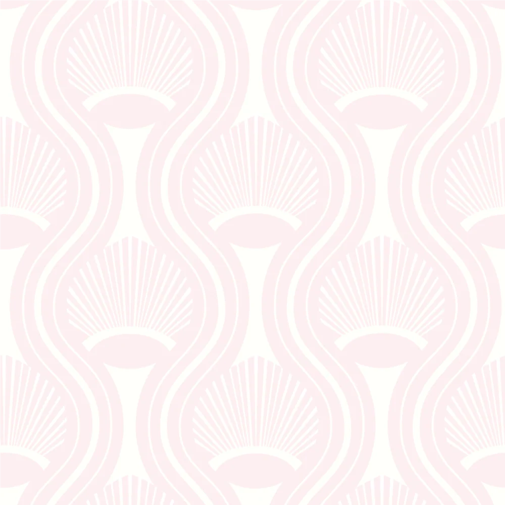


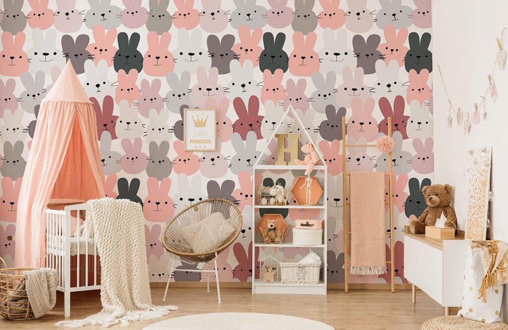


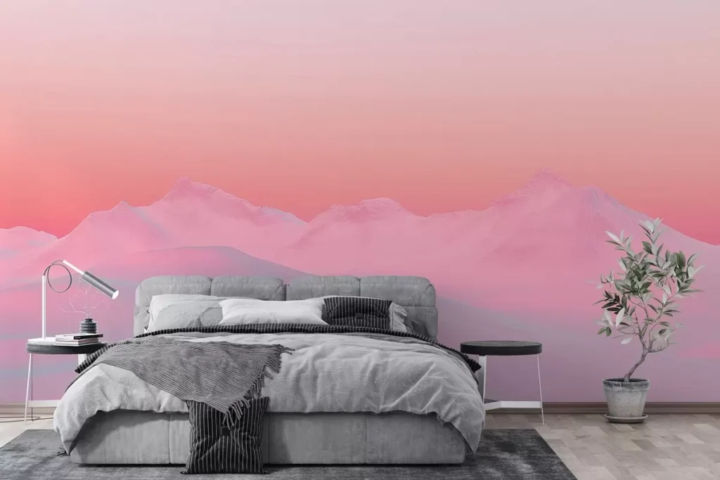


Why Pink Wallpaper Isn’t Just for Little Girls’ Rooms Anymore
Pink has evolved. It’s not just for nurseries or bubblegum-themed parties. In modern interiors, pink means bold, soft, daring, moody, elegant, or even edgy. It all depends on how you use it. If you’re looking to revamp your space, explore the world of pink wallpaper. It’s one of the fastest, most transformative design moves you can make. And it’s not what you think.
Let’s clear up the misconception: pink doesn’t mean overly feminine anymore. It’s a statement. A texture. A backdrop that can completely reframe a room.
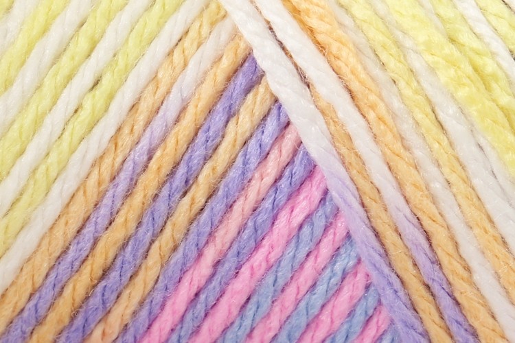
First, What Counts as “Pink” These Days?
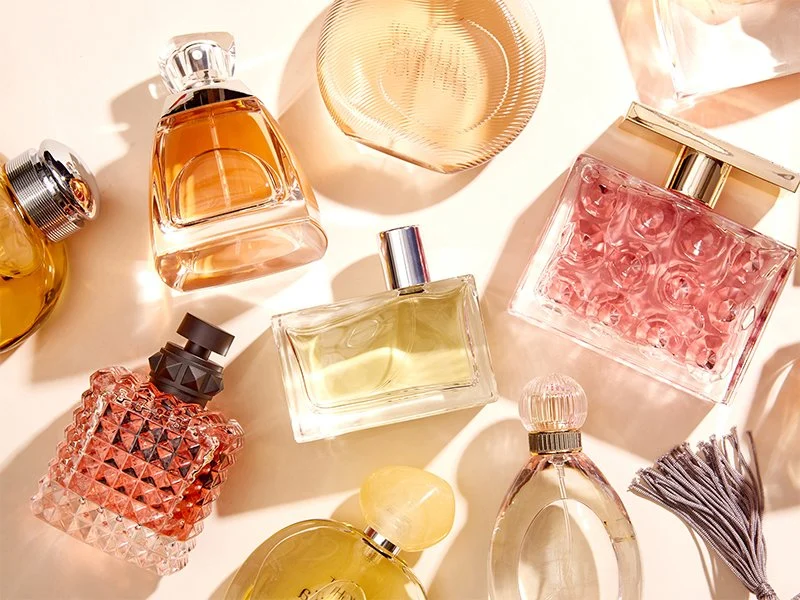
This isn’t just Barbie pink.
We’re talking:
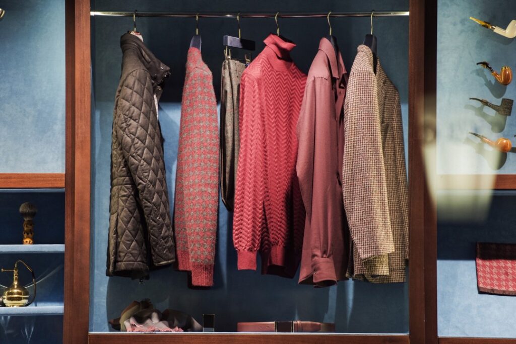
- Blush
- Dusty rose
- Coral
- Mauve
- Terracotta
- Salmon
- Rosé
- Millennial pink
- Bubblegum (yes, still valid)
Each tone gives off a different energy. Light blush feels clean and airy. Mauve gives off a vintage or moody vibe. Coral feels punchy and tropical. Dusty rose leans classic and grounded.
Choosing the right tone is key. It’s not about picking a random pink and hoping for the best.
Why Wallpaper Over Paint?
You might be wondering—why wallpaper? Isn’t paint easier?
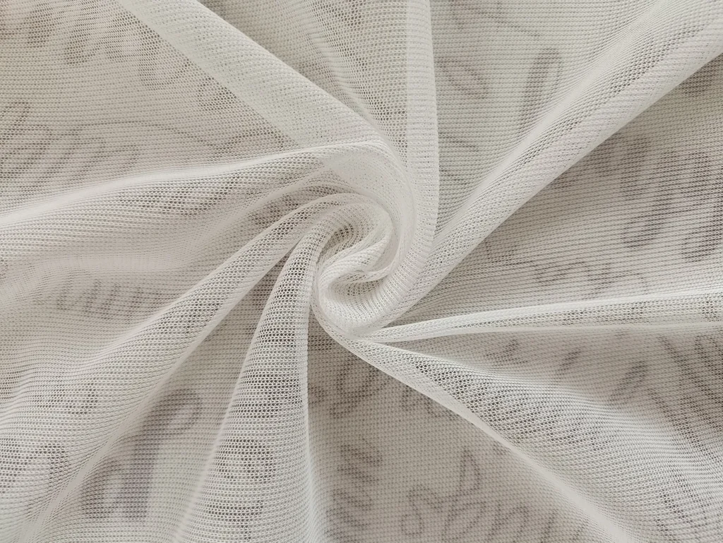
Here’s the truth: Wallpaper adds depth that paint can’t touch.
- Texture: Some wallpapers are embossed or fabric-based. They catch light. They create a shadow.
- Pattern: You get florals, geometrics, stripes, marbling, ombré, abstract prints—you name it.
- Character: One wall can tell a story. Paint just… covers it.
- Durability: High-end wallpaper holds up. It doesn’t scuff or chip like paint.
Wallpaper looks intentional. High-design. Thought out. And in many cases, it’s peel-and-stick. No messy glue. No permanent commitment.
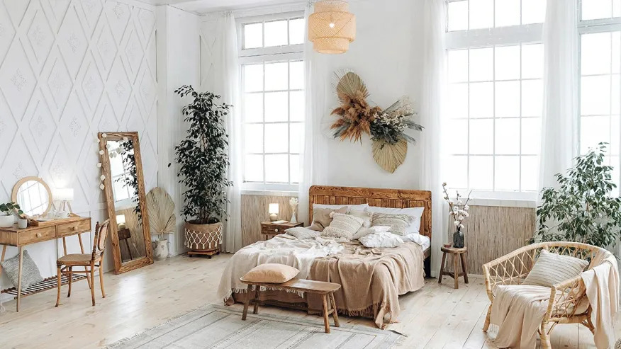
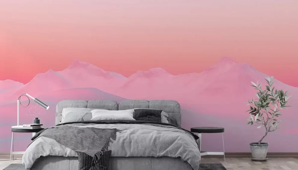
Where to Use Pink Wallpaper (Besides Bedrooms)
This is where it gets exciting. Pink wallpaper can go anywhere—when used smartly.
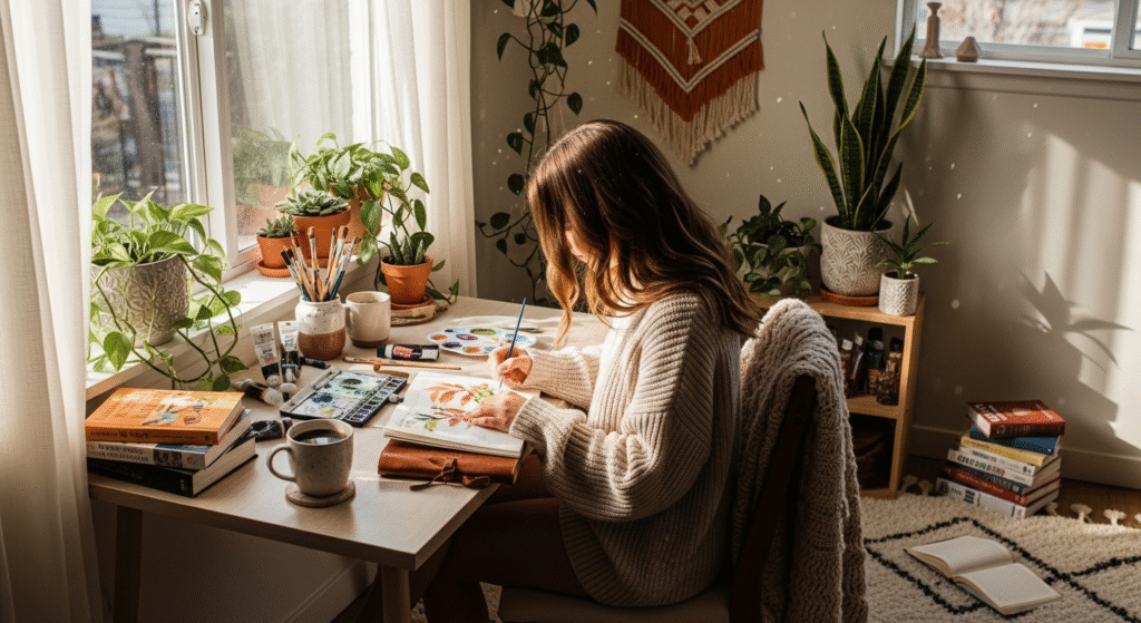
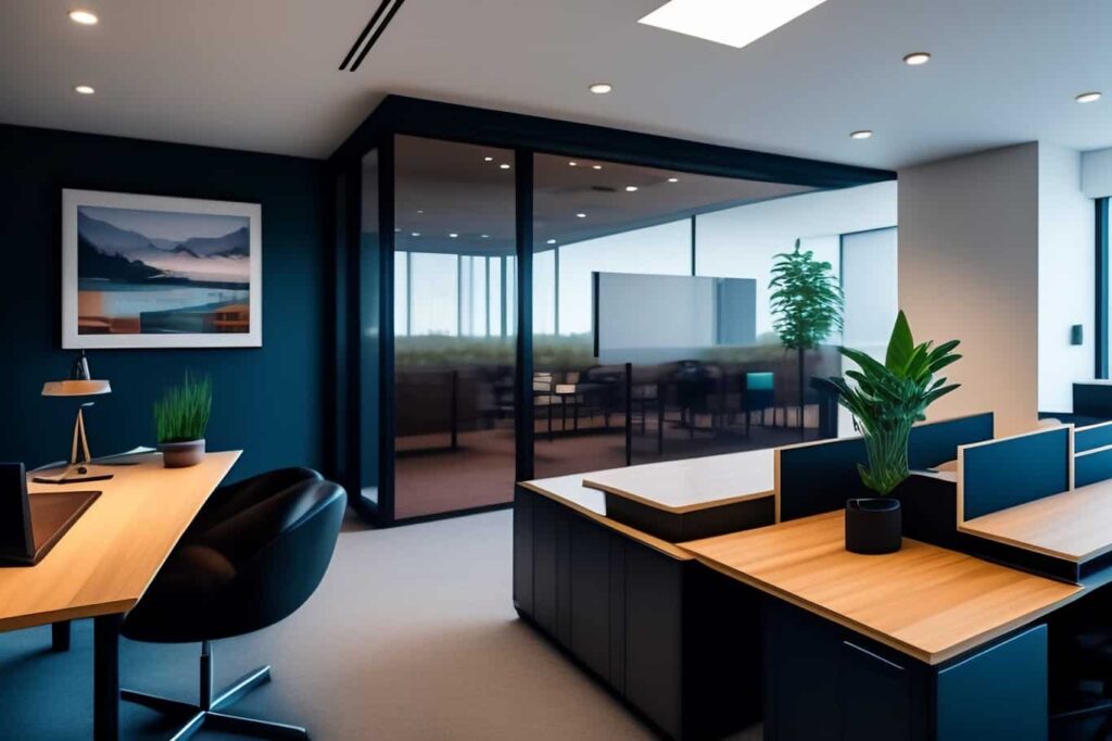
1. Home Office
Want a space that energizes and soothes? Pink tones like soft coral or dusty blush do just that. Try a geometric or abstract pattern for a creative vibe. Or go floral if your office has natural light—it’ll bounce beautifully.
2. Powder Room
The smallest room in your house can be the most dramatic. Think moody pinks with metallic accents or intricate patterns. Go all in—walls, ceiling, maybe even the door.
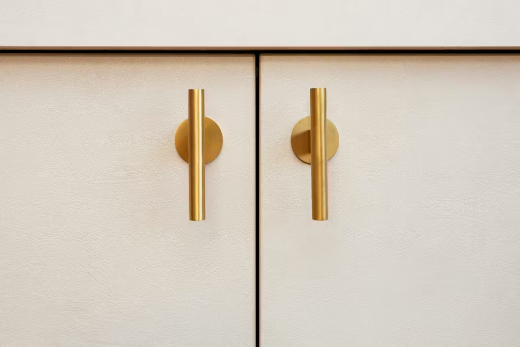
Tip: Match your hardware (faucets, knobs) to the warmth of your wallpaper. Brass or gold pairs perfectly with warm pinks.
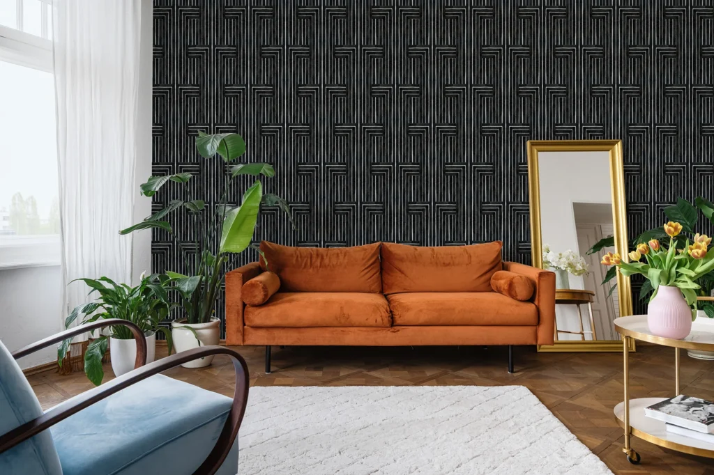
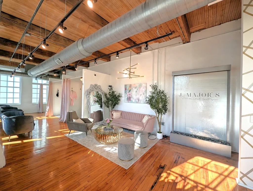
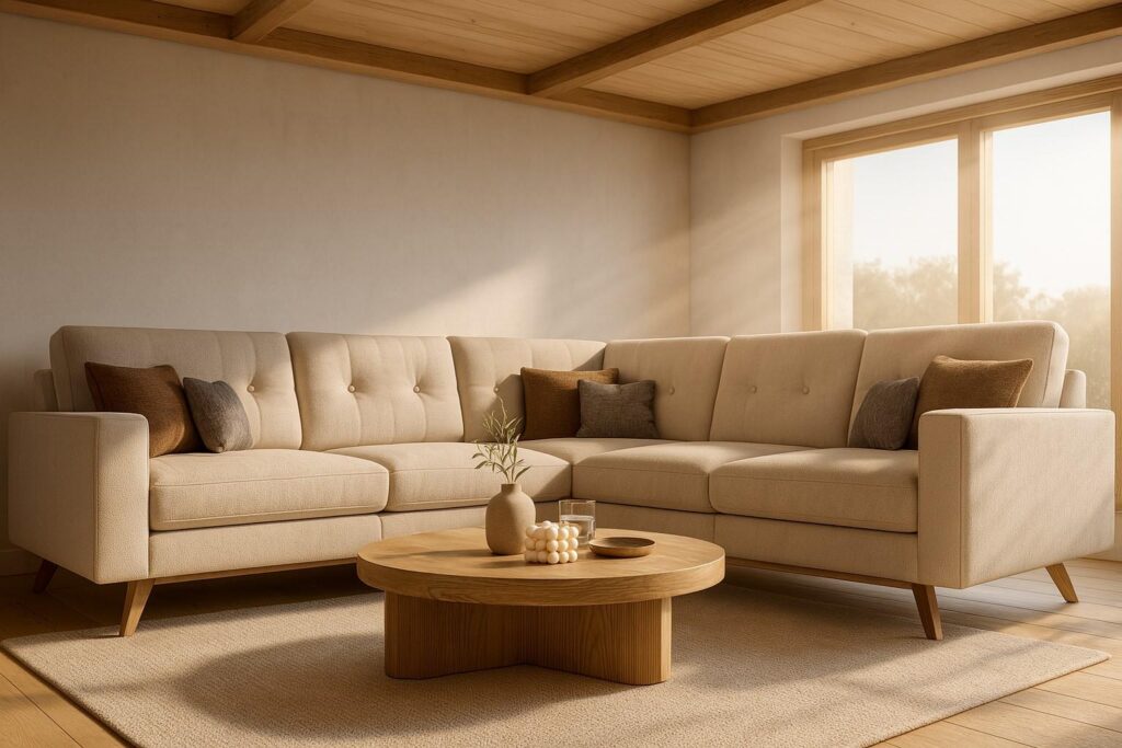
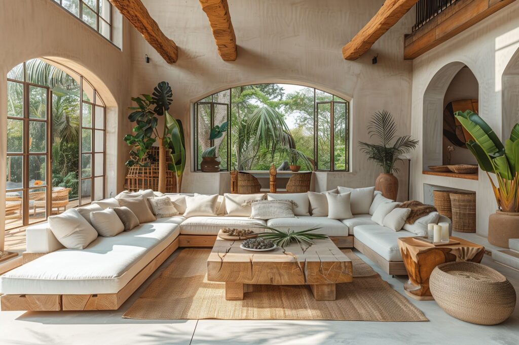
3. Living Room Accent Wall
You don’t have to cover every wall. One statement wall behind a sofa can change everything. Try textured pink wallpaper with tonal patterns—florals, arches, or even palm prints. Keep furniture neutral. Let the wall do the talking.
4. Dining Nook or Breakfast Area
Warm tones encourage appetite and conversation. A terracotta-pink with a subtle print? Perfect. Add in wooden chairs, white tile, and soft pendant lighting. Suddenly, it’s a designer café in your own home.
5. Hallways and Entryways
These areas are often overlooked, but they’re the first impression. A bold pink print with movement—like waves, vines, or zigzags—can make a narrow hallway feel longer and more alive.
Pairing Pink Wallpaper With the Right Design Style
Modern? Vintage? Maximalist? Minimalist? There’s a pink wallpaper that fits each vibe.
✦ Scandinavian Minimalism
Use pale pinks. Think blush, ivory, soft peach. Pair with white oak furniture, linen fabrics, and lots of light.
✦ Mid-Century Modern
Go for coral or salmon tones with retro-inspired patterns. Pair with walnut wood and brass fixtures. Keep shapes clean and bold.
✦ Boho Chic
Look for mural-style wallpapers or botanical pinks. Layer in textiles—rattan, cotton, macramé. Add greenery for contrast.
✦ Glam
Deep pinks with metallic accents. Velvet furniture. Crystal lighting. High drama. Think rose gold foil against deep rose tones. Yes, please.
✦ Industrial
Contrast soft pinks with concrete, black metal, and reclaimed wood. Try a gritty floral or marbled print to soften the edge—without losing your cool.
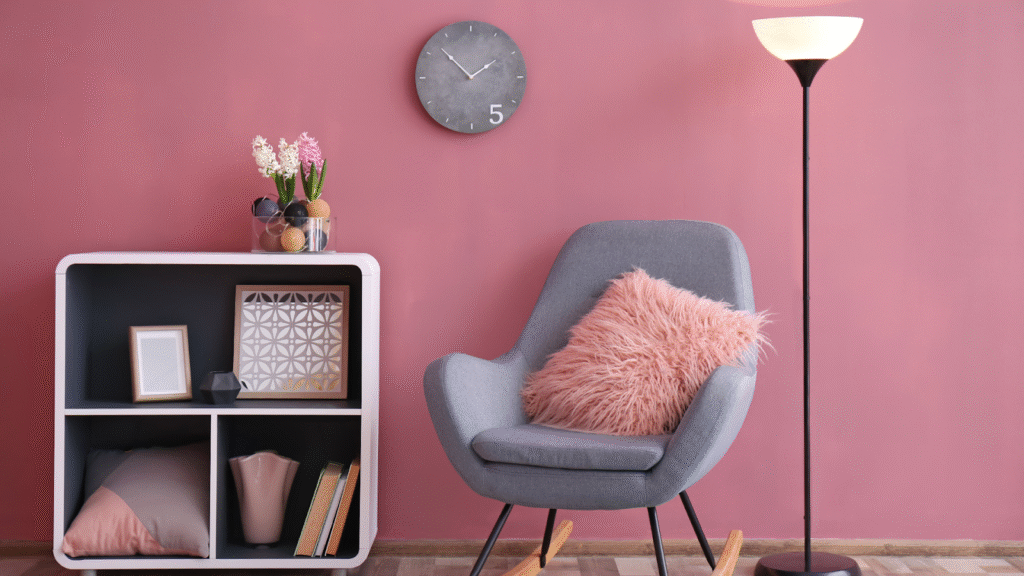
Tips for Styling With Pink Wallpaper
- Start with one wall: Don’t commit to every wall unless you’re confident in the style. One bold feature wall usually does the trick.
- Balance the tones: If your pink is bold, let your furniture and accents stay neutral. If your pink is pale, consider adding bolder accessories.
- Repeat the hue subtly: A throw pillow. A piece of art. A ceramic vase. It helps tie the room together.
- Mind your lighting: Warm lighting enhances pink tones. Cool lighting might wash them out or make them look purple. Always test samples first.
- Avoid the cliché: Skip the “baby girl” decor. Unless that’s your goal, lean into sophisticated patterns, organic shapes, or modern geometry.
Yes, Men Like Pink Too
This isn’t about gender. It’s about energy. Pink brings warmth, confidence, calmness, and even edge. And in 2025? Nobody’s flinching at a man using pink in his studio, office, or home gym.
Design-forward homes use color with purpose, not stereotypes.
Real Customers Are Doing Wild Things with Pink Wallpaper
We’ve seen it all:
- A Florida architect wrapped his hallway in a neon pink hexagon print. Paired it with cement floors. It’s breathtaking.
- A Brooklyn designer lined the inside of her kitchen cabinets with pink floral wallpaper. Just for a visual surprise.
- An Arizona couple added ombre pink wallpaper to their stairwell. Every floor has a slightly different hue. It’s art.
The point? You don’t have to play it safe. Pink can be a pop or a power move. It all depends on how you style it.
Final Thoughts: Pink = Personality
Color changes the way we feel in a space. Pink is no longer about innocence. It’s about intention.
Use it to create softness. Use it to create contrast. Use it to be bold. Or to be calm, but above all—use it well.
If you’re ready to rethink what pink can be, explore the full collection of pink wallpaper.
You’ll never look at the color the same way again.